User interviews · Website audit · Sitemapping · User journeys · Wireframing · Workshop facilitation · User testing
◆
MediaMonks, 2018 - 2019
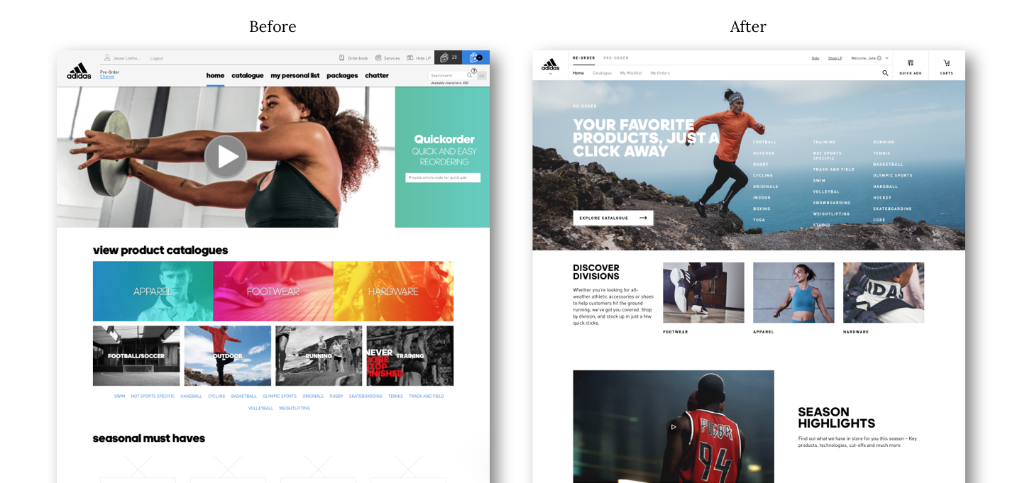
adidas CLICK is the global B2B platform for adidas and Reebok retailers to re- and pre-order products to stock up their stores. Apart from ordering large quantaties of products, users can keep track of their orders by checking their order status and stay up to date with adidas campaigns and developments.
Goal
The goal for this platform was to understand the user needs of the B2B platform through user interviews, to grasp the contents of the current platform and make sure to elevate the user journeys to a higher level by creating an easy to use and consistent, on-brand platform using adidas' design system: aDL (adidas Design Language).

The process
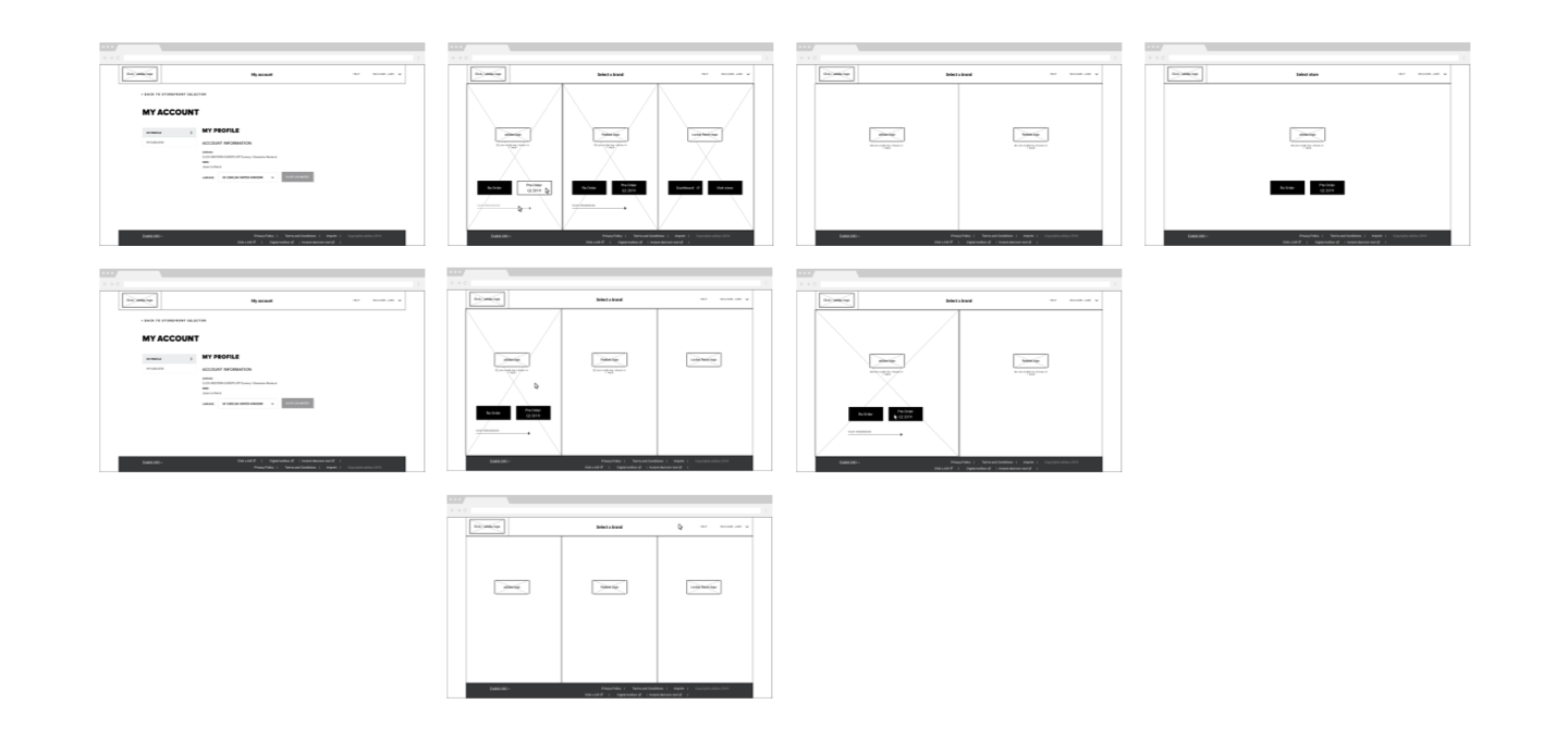
Together with a dedicated team of UX (m

After this exercise, I went to Manchester together with a strategist, to visit a pre-order event organised by one of the adidas CLICK regions. If there is a place to get to know the users and the way they use CLICK, this would be a great start. All the people that walk around there are users of the B2B platform and are using it while exploring the new season products.

Challenges
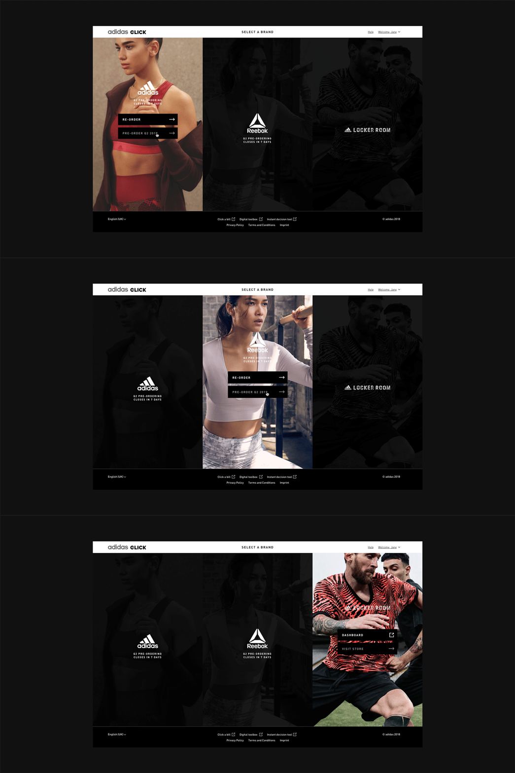
adidas CLICK wasn't just a straight forward platform for one or two particular users, but it was a global platform for different users with different top tasks and different rights throughout the platform. Not all users could access the adidas store and the Reebok store, nor did all users have the rights to visit both re- and pre-order stores.
And also time played a vital role in this platform, e.g. when pre-order was about to close, we'd want to give the users a heads up that they have x amount of days left to assemble their order and place it. Factors which played an important role throughout the platform.

The biggest challenge
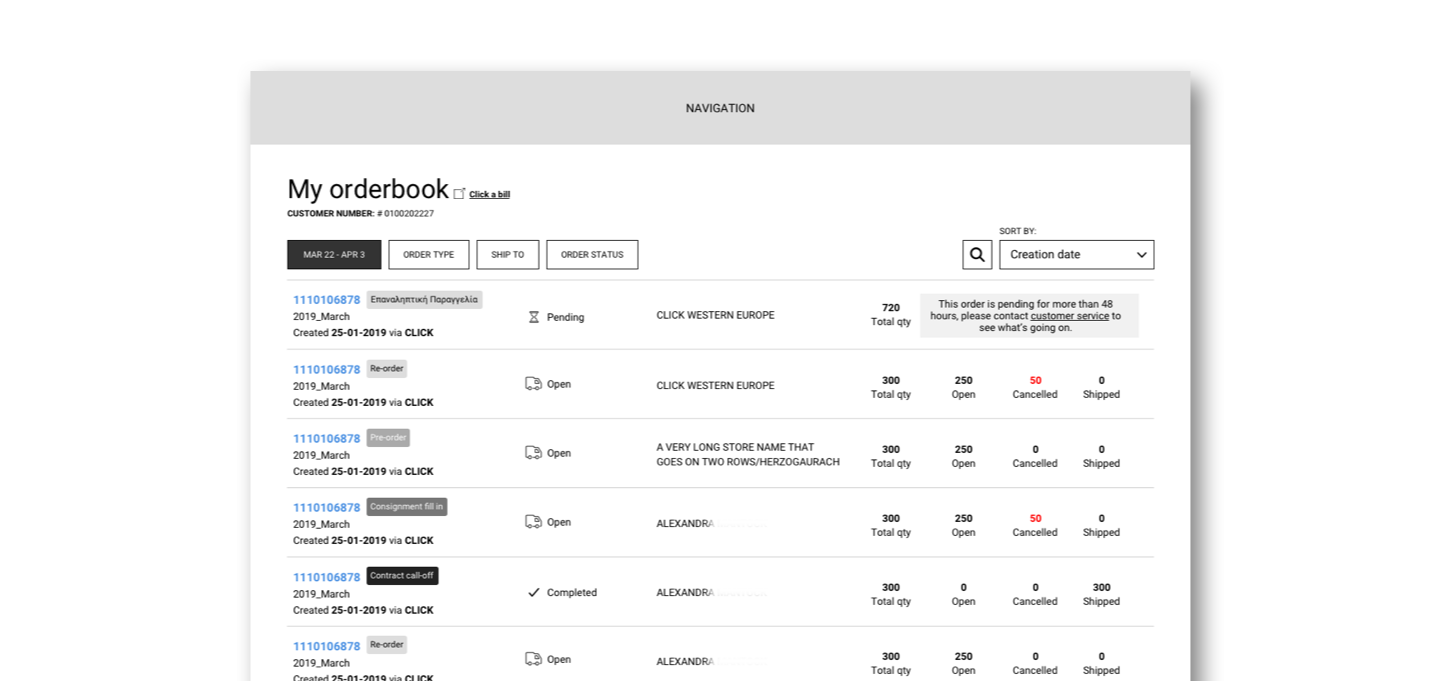
Probably the biggest challenge of them all was the orderbook, in which users keep track of the status of re- and pre-orders they placed and if products are cancelled. The complexity on this particular page was tremendous, and definitely also one of the places we could bring delight to the users.
Because of all the complexity in this page, we conducted (on- and offline) user tests to put our work to the test and to make sure we were creating something of value for the user. This platform after all was where a big part of their day was spend in order to keep their stores stocked.

Takeaways
→ B2B is very hard to do benchmark research on, but (in this case) the client knows all their B2B users and are therefore easy to reach
→ 
→ Always ask developers for possibilities, they know the capabilities and restrictions of the platform, they know the legacy that need to be dealt with