User journeys · Design system · Wireframes · Scrum
◆
MediaMonks, 2020
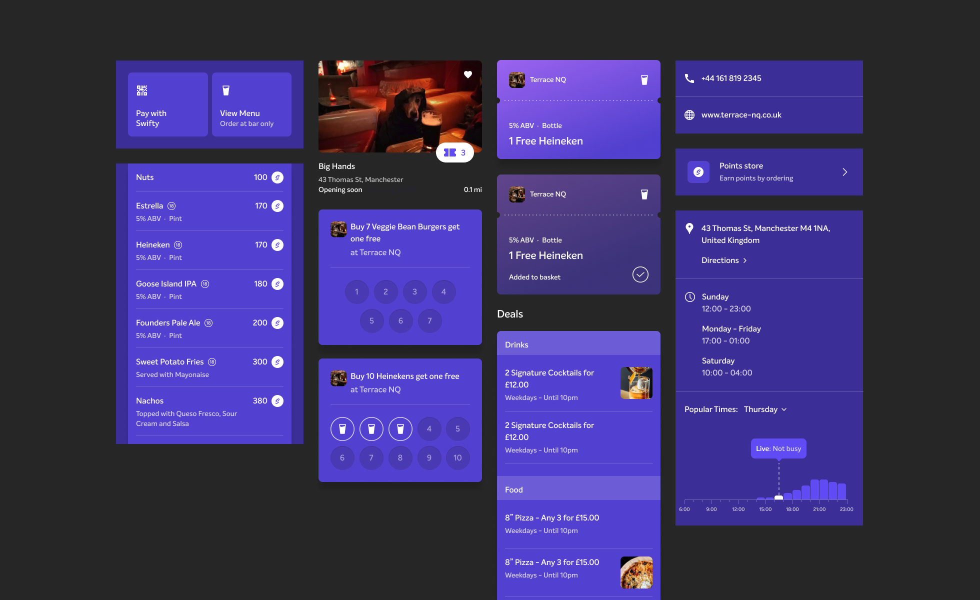
Swifty is an app that allows user to order food and drinks at the bar, including a loyalty system where the user can collect and spend points at their favorite Swifty spots.
Goal
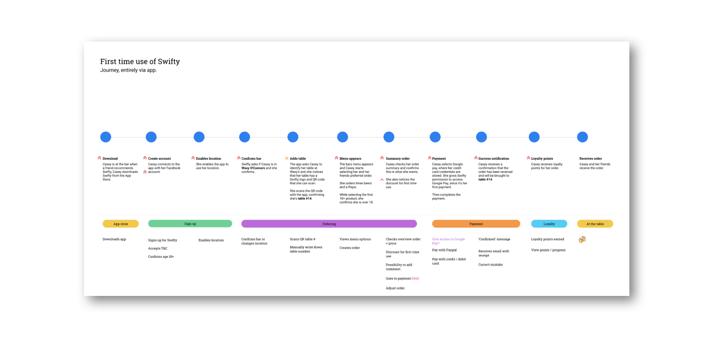
Swifty was an app by Heineken that needed to be build from scratch. We needed to understand the user journeys from the app, how to onboard users, how to make their re-order experiences easy and how to use their loyalty points. A challenge in which the on- and offline world needed to be connected seamlessly.

The process
In this project I worked closely together with the designer using Figma. The duration of this project was six weeks, covering three sprints and therefore we were challenged to work as closely and efficiently together as possible, while we both kept challenging another to keep pushing the product further.

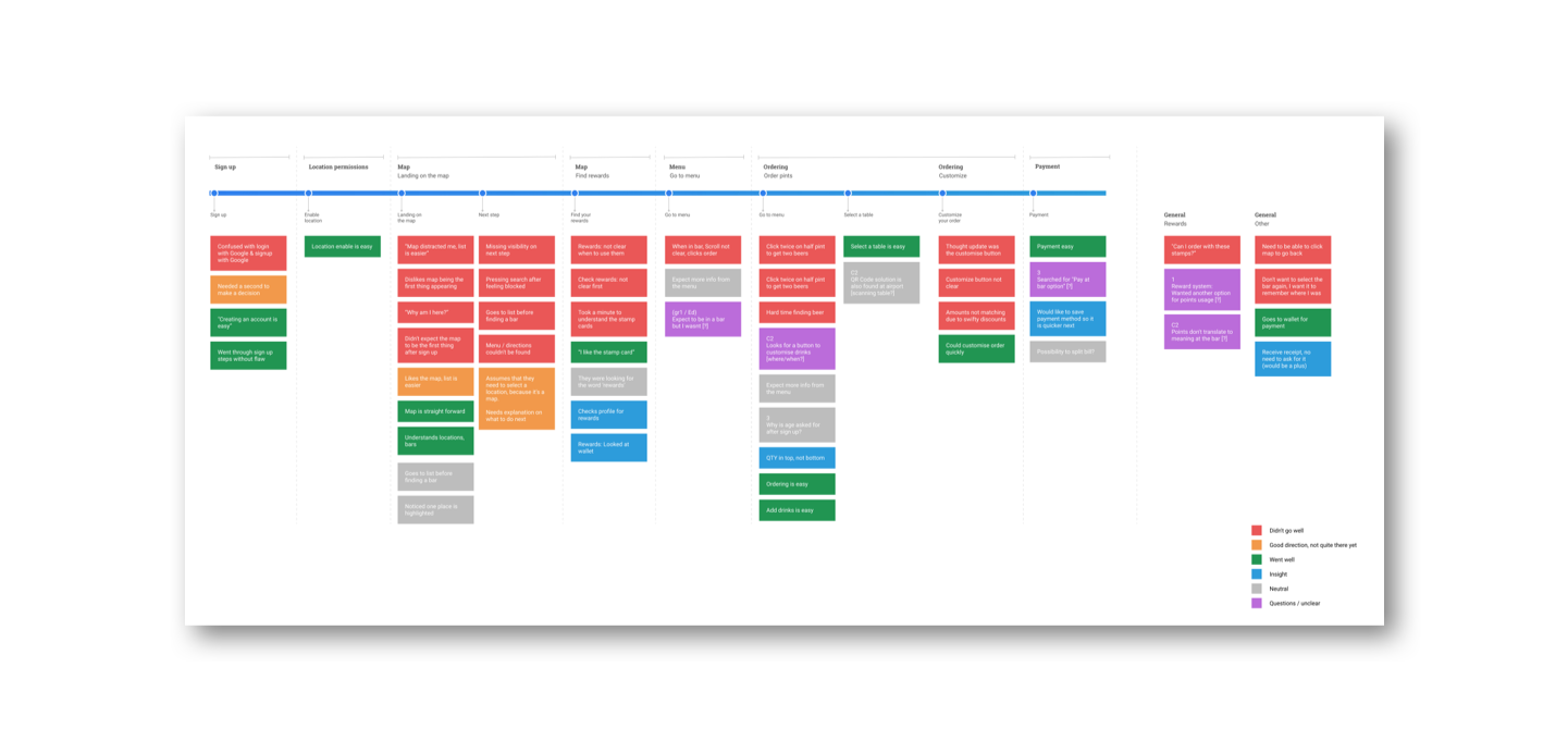
User test results analysed: All feedback is color coded and plotted on a place in the journey. This way we could easily find which parts of the journey had the most room for improvement
Challenges
This project was challenging due to tight the deadline, the abundance of ceremonies that a scrum project brings and the change in direction that took place after user test results or development restrictions. We were building the plane while flying, so our flexibility was definitely challenged.

Design credits to Jack
Takeaways
→ Trust the process and don't let changes scare you off, stay flexible
→ Stay ethical, users can easily order beers in this app. We as designers have a responsibility on safe guarding the mental-, physical- and financial health of the user
→ Keep challenging each other for a better product