Audits · (unmoderated) user testing · Design · Processes
◆
IKEA, 2022, 2023
IKEA has rapidly build their digital team in the last few years. This rapid growth naturally comes with its own challenges. Being positioned in the checkout vertical, I focus on consolidating and determining a consistent web checkout experience, to have a solid foundation and playground for experimenting with ideas. Here I highlight some of the work I did and am doing at IKEA.
Goal: Create a consistent web checkout experience
Due to a variety of factors, the IKEA web checkout flow is not the cohesive flow the customer need. Because of this, it is can get fairly difficult to get through the flow. My goal was to create a foundationally consistent web checkout flow, that will enable the customer to go more easily through the flow and help the team to set a stronger foundation for experiments.
Starting with the copy audit below.
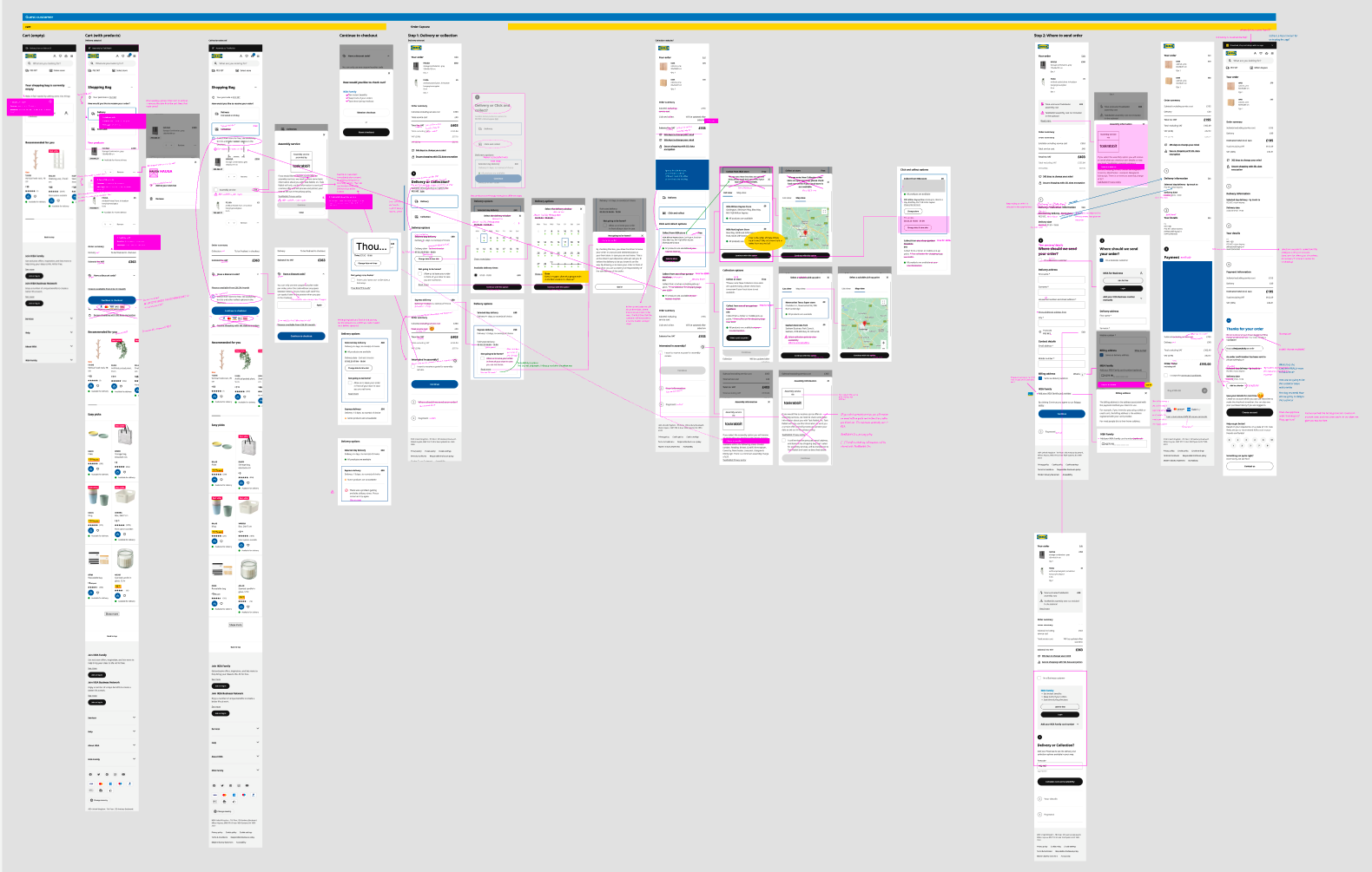
The results of the audit my copywriter and I did for the checkout flow. Here we tried to understand the terminology used, the order in which it's given, where copy is repeated, etc.
The copy audit
In order to understand how we can improve the experience, we need to understand it's flaws and pain points. Together with the copywriter from my team, we went through the entire flow, nitpicking on every single word that we also serve to the customers (we chose the UK flow, since that one covers a lot of scenarios and English is used).
The conclusion? We struggled with understanding certain terms we use ourselves, we use different words for the same things, explanations are unnecessarily lengthy or complicated, and the order in which we present information, doesn't always make sense. We re-wrote almost everything.
Actions
» We ran a workshop testing the vocabulary with our internal team to learn if we internally understand the flow (example result below)
» We rewrote everything that's unclear, inconsistent or too lengthy
» We tested vocabulary that we assumed was unclear via UserZoom
» We learned the ins and outs of Phrase (the software where all mastercopy lives), so we can match the copy with the Phrase keys, and enable an easy collaboration flow with the engineers in order to change the copy
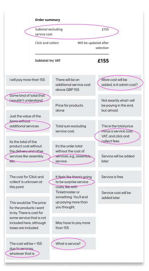
Via Menti.com (live poll/survey poll tool), we asked our team if they understand what 'Service costs' mean in our order summary. The results show that even our internal team doesn't know.
The extended audit
Naturally, while doing this audit we also encountered many visually outdated and inconsistent design elements, hierarchical illogicalities and absent patterns. Plenty reason for us to add those elements to our spring cleaning list as well.
With the design team, we re-created the current flow in Figma, but with the new copy and design elements. Attached to the copy, we added the Phrase keys (the place where we distribute new copy or copy updates), so when we talk to our engineers, they'll know what keys to update.
Actions
» We updated the master templates and redesigned overly complicated components
» We aligned the outdated designs with the up to date versions from our Design System
» We plotted the Phrase Keys to the designs, to help development understand what copy belongs where

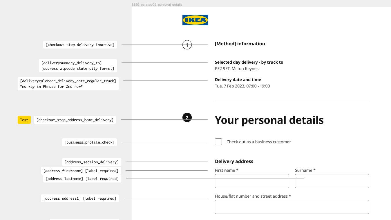
Phrase keys applied to cleaned up Master design template
Results & Next steps
» This audit provided us with a lot of insights around what unclarities should be fixed
» Getting these (low hanging fruit) unclarities out of the way helps our customers understand the checkout flow better, even without doing big changes
» When this is implemented, it'll be easier and more logical to start bigger experiments